Instructables is an online community of people who like to make things. The website has been around for quite some time and needed a modern refresh. I worked with our internal product team to gather insights from our users and then update a few core areas of the site with big user experience impact, including the site-wide navigation, the homepage and the search experience.
My roles: conducted and analyzed user research, created mockups, gathered feedback, iterated on designs, worked with product manager to break into manageable steps and write up specs, and collaborated closely with our development team to ensure a successful launch.

Process
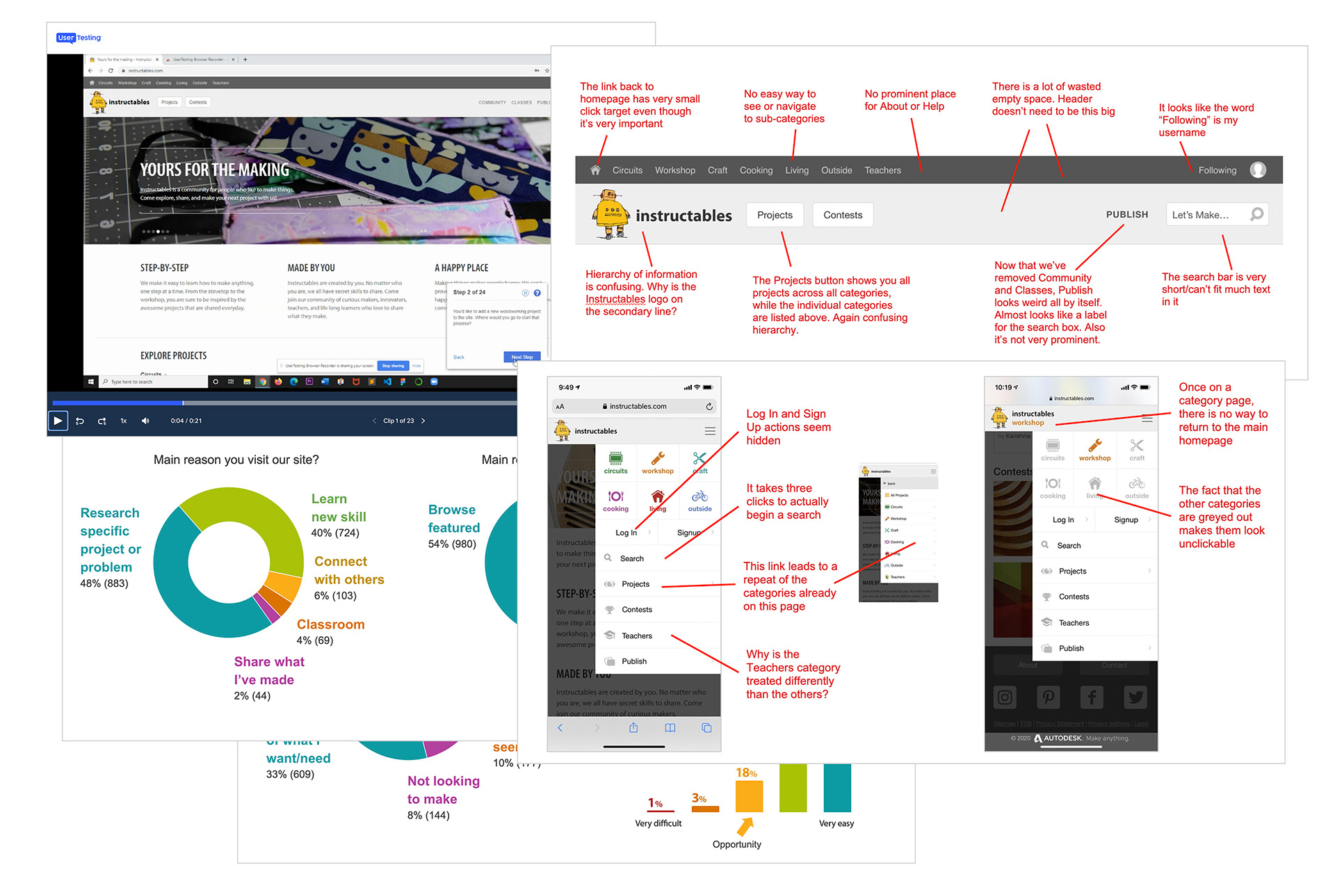
I helped lead a round of user research so that we could better understand how users experience our site and what pain points they had. I ran UserTesting.com tests to get a feel for how a new visitor navigates through the site. We also sent out a survey to all of our existing users and conducted live video interviews to hear from long-time members of our community.
Navigation goals & insights
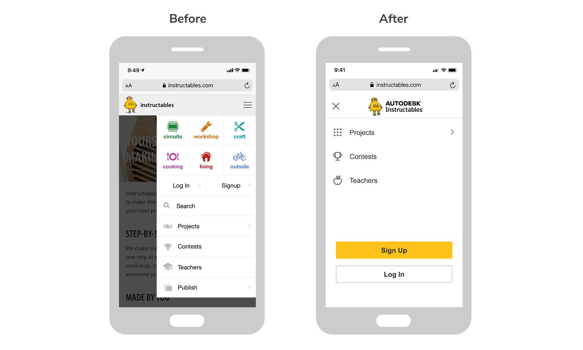
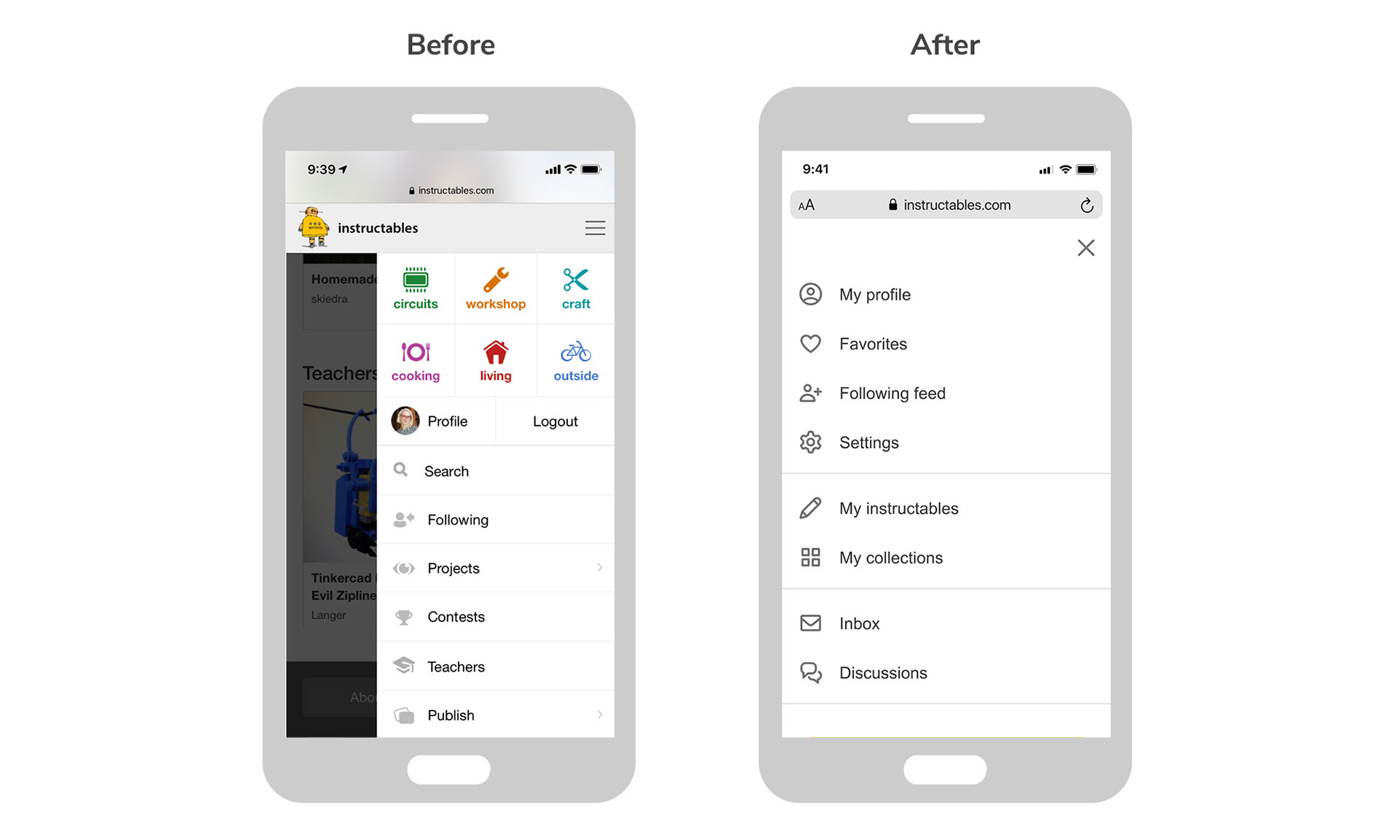
User testers had difficulty navigating to certain parts of the site (especially on mobile), struggled with the search, and lacked general awareness of our parent brand.
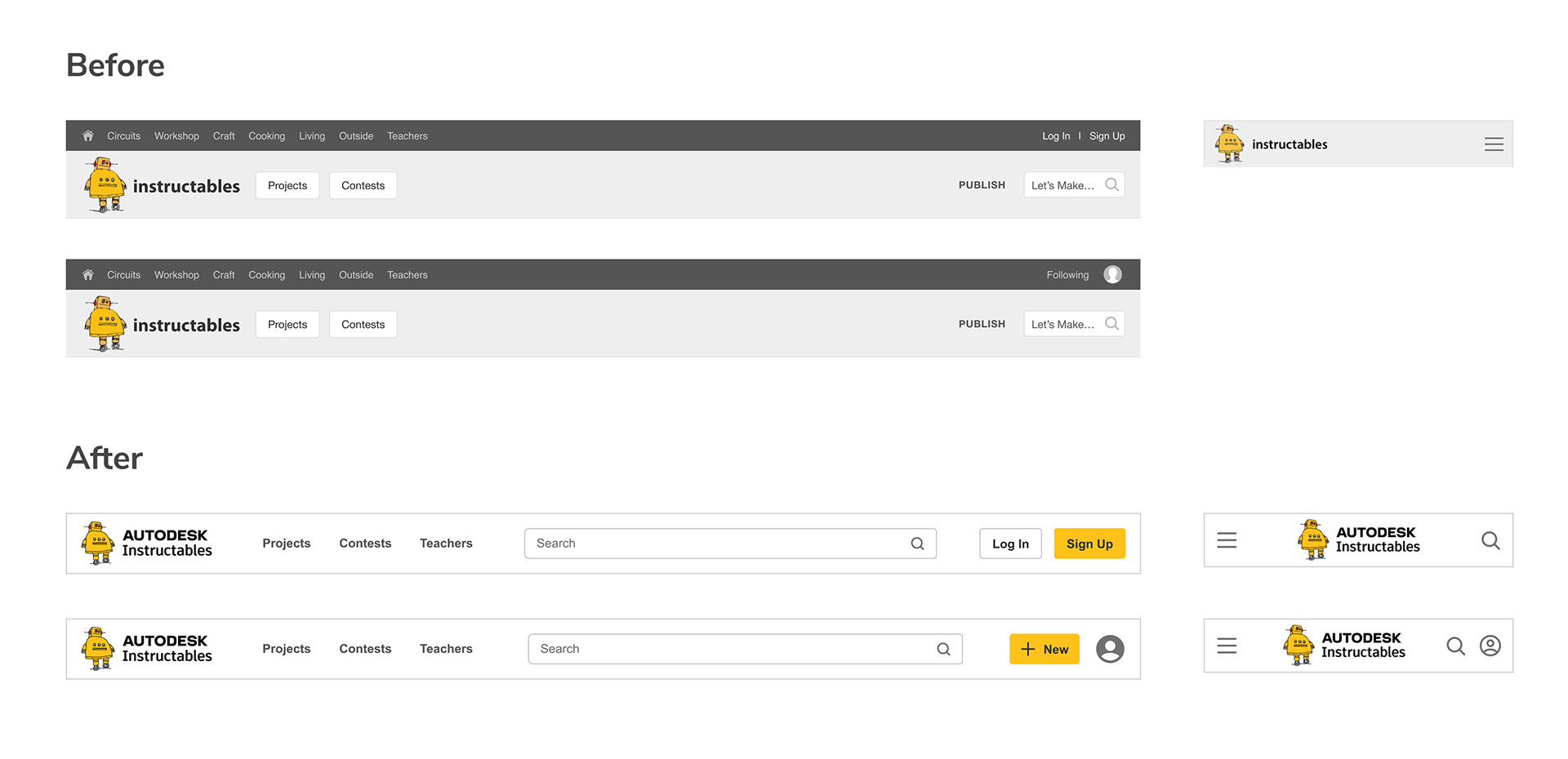
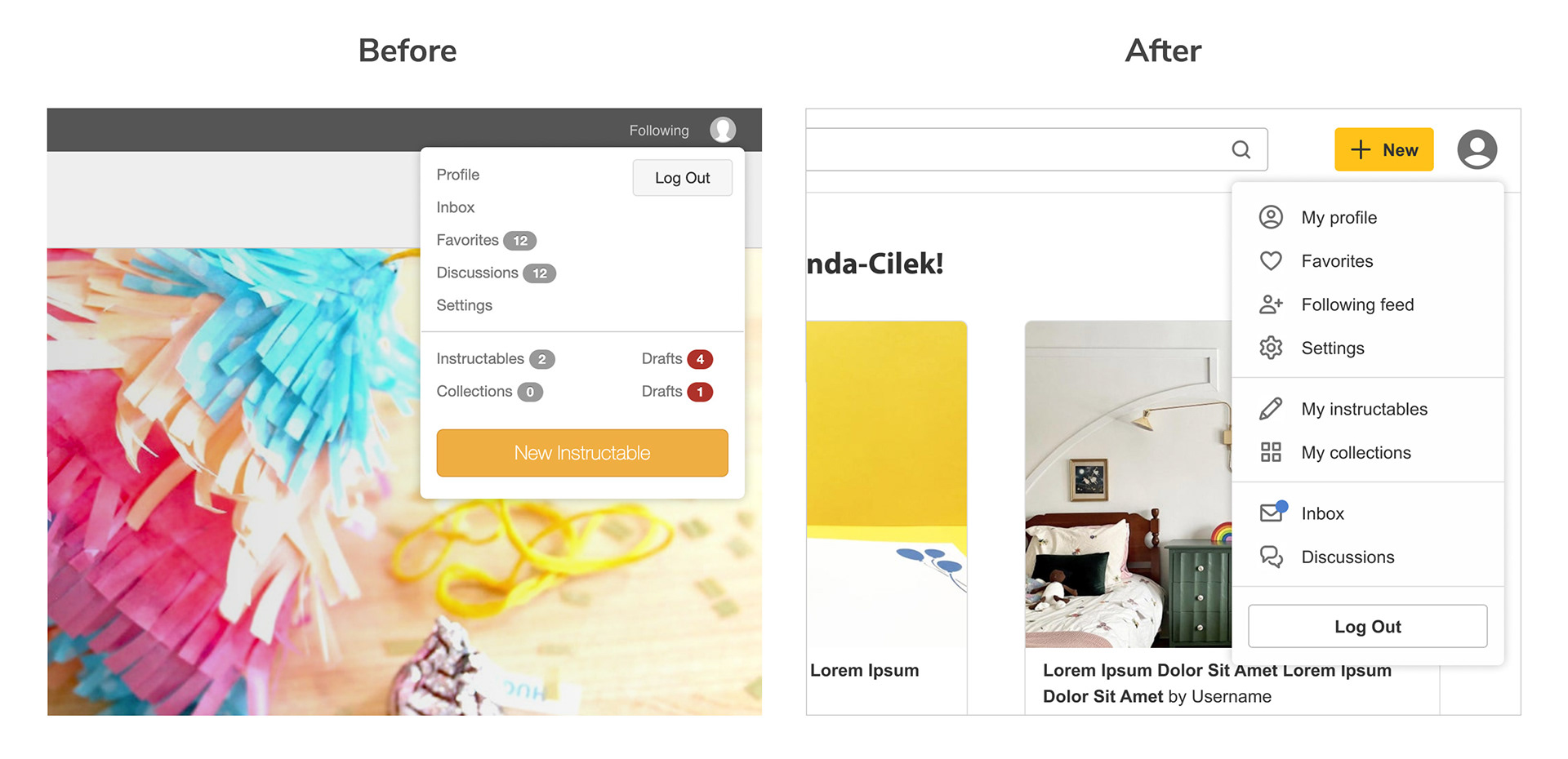
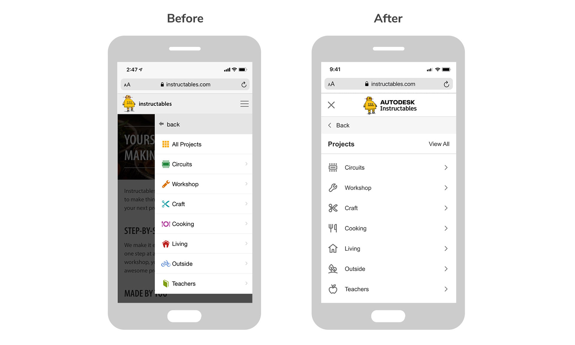
• Improve hierarchy of information by collapsing top links into a centralized "Projects".
• Make it easier to get home and treat the main logo consistently from page to page.
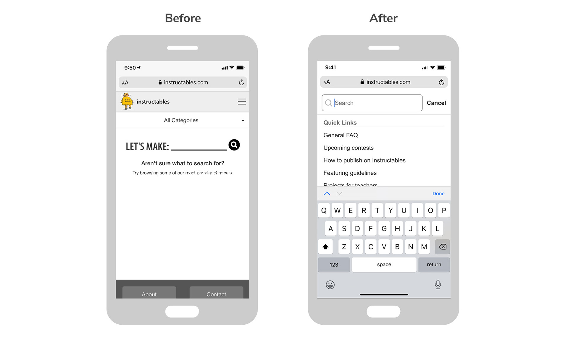
• Make top search bar larger and more prominent. On mobile, put in main header.
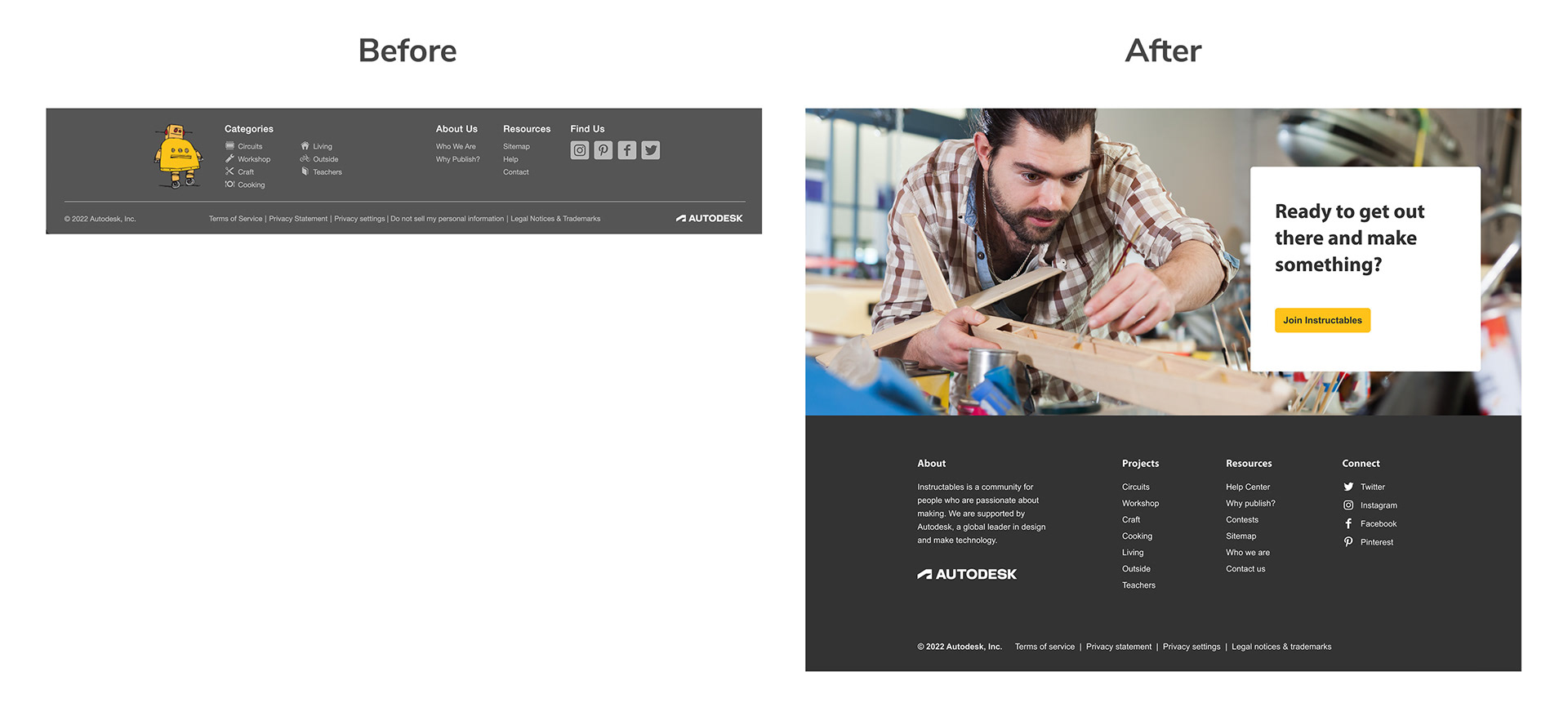
• Update the logo and footer to clearly connect with the Autodesk brand.
Homepage research
Quotes from long-time users about the old homepage:
"I’ve been using Instructables for longer than I can remember. Most of the homepage is promoted, stuff about Instructables, instead of the projects I might be looking for. I come back to the site all the time - I don’t need to know what the site’s about. "
"The fact that the projects are not the first things that are featured. I think that banner is a little confusing. Once I get past the banner and get down to exploring projects, I’ll generally find something that piques my interest."

Homepage goals & insights
The big takeaway here was that the top banner and marketing blurbs were interesting to first-time visitors but not at all useful to long-time members who have been using Instructables for years and just want to see projects.
• Different homepage views depending on whether the user is logged in or logged out.
• For logged out (new) users, show marketing and feature staff curated collections.
• For logged in users, skip the marketing and show projects from their custom feed.
• Add more content and update frequently. Users have no motivation to visit if static.


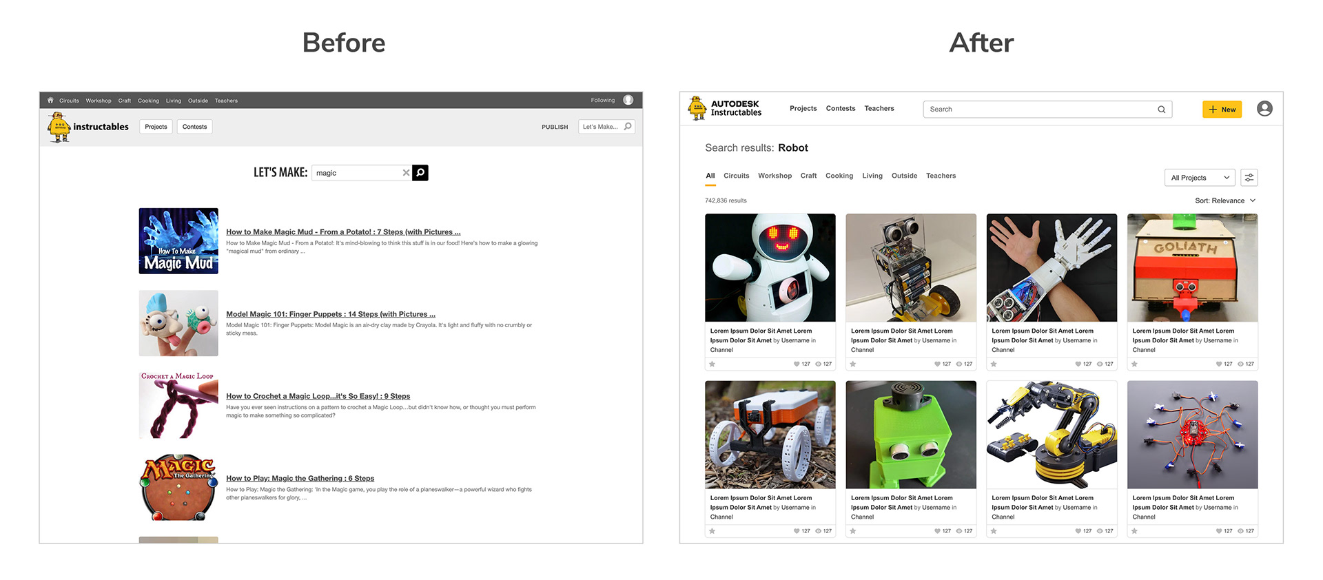
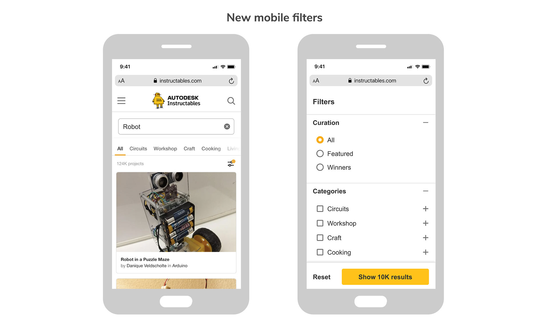
Search goals & insights
From the surveys, at least one third of people come to the site with a clear idea of what they are looking for. The most consistent feedback we got from the surveys is to make it easier to find the specific things they're looking for on the site. Another problem to solve was that we were serving different search experiences based upon whether a user was logged in or out.
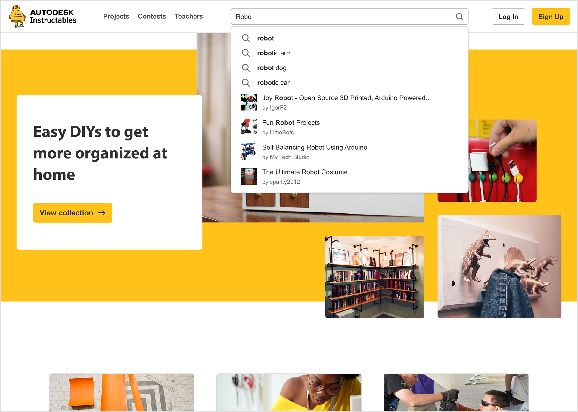
• Same consistent search experience for logged in and logged out users.
• Implement autocomplete to display real-time project results as the user types.
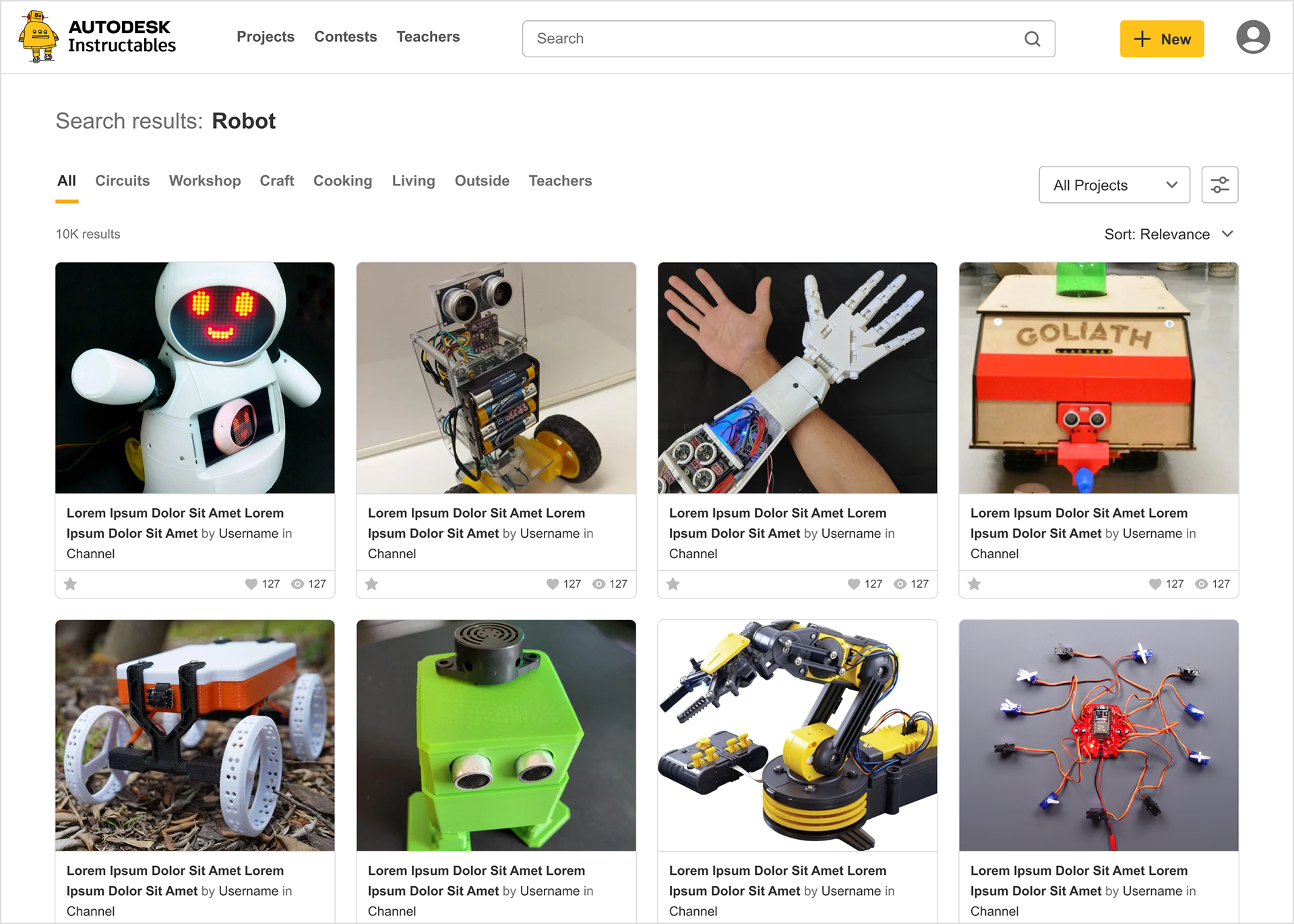
• Display results in a large grid format for easy visual scanning.
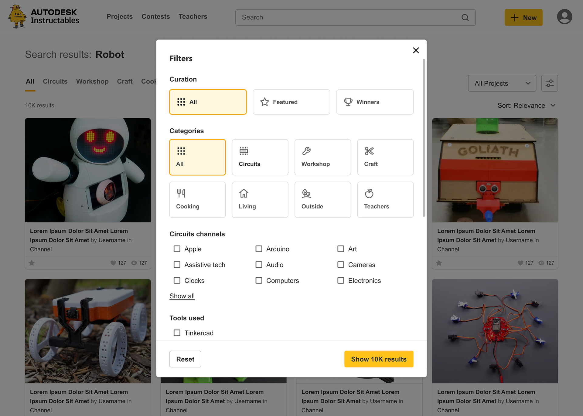
• Add new filters and sorting options to help users hone in their results.