Tinkercad is a free app for 3D design, electronics, and coding used by millions of students and creative innovators worldwide. This project was a refresh of the logged in dashboard view and user profile pages to better align with new Tinkercad branding and improve overall usability and functionality.
My roles: research and ideation to detailed final design specs and working closely with developers to implement and QA test.

Opportunities for improvement
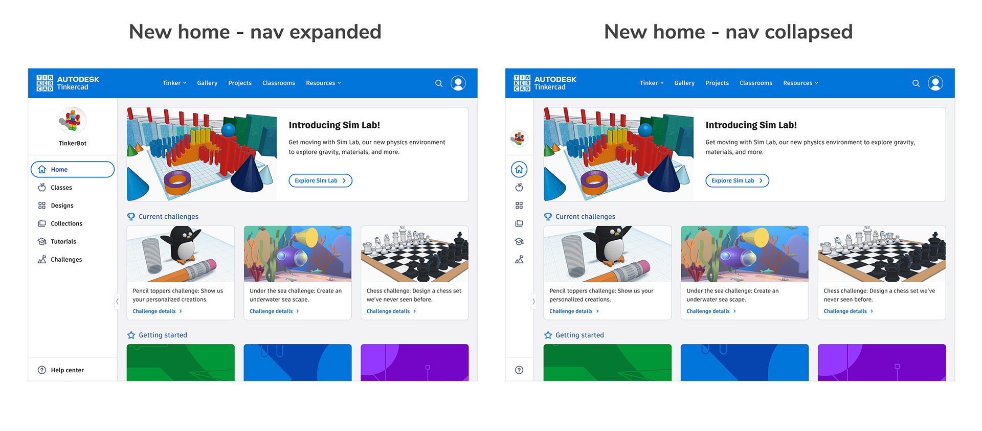
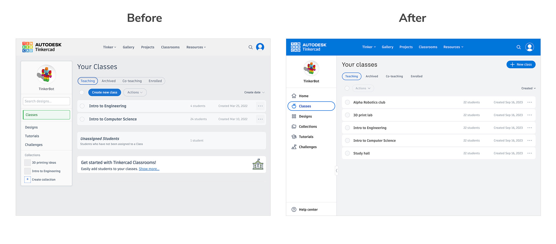
The old dashboard dropped you straight into the class or design view (depending on user role) and lacked any sort of space for in-app communication about new features, upcoming events, or helpful tips. It also had an odd left nav panel that varied in height depending on how many collections there were and a search function that only sometimes worked.
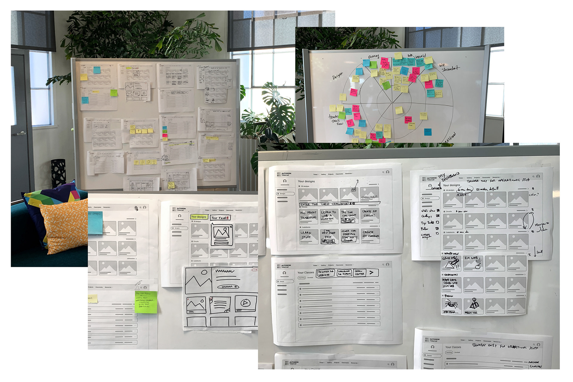
We started by conducting a number of group brainstorming exercises to imagine the ideal future of the dashboard.
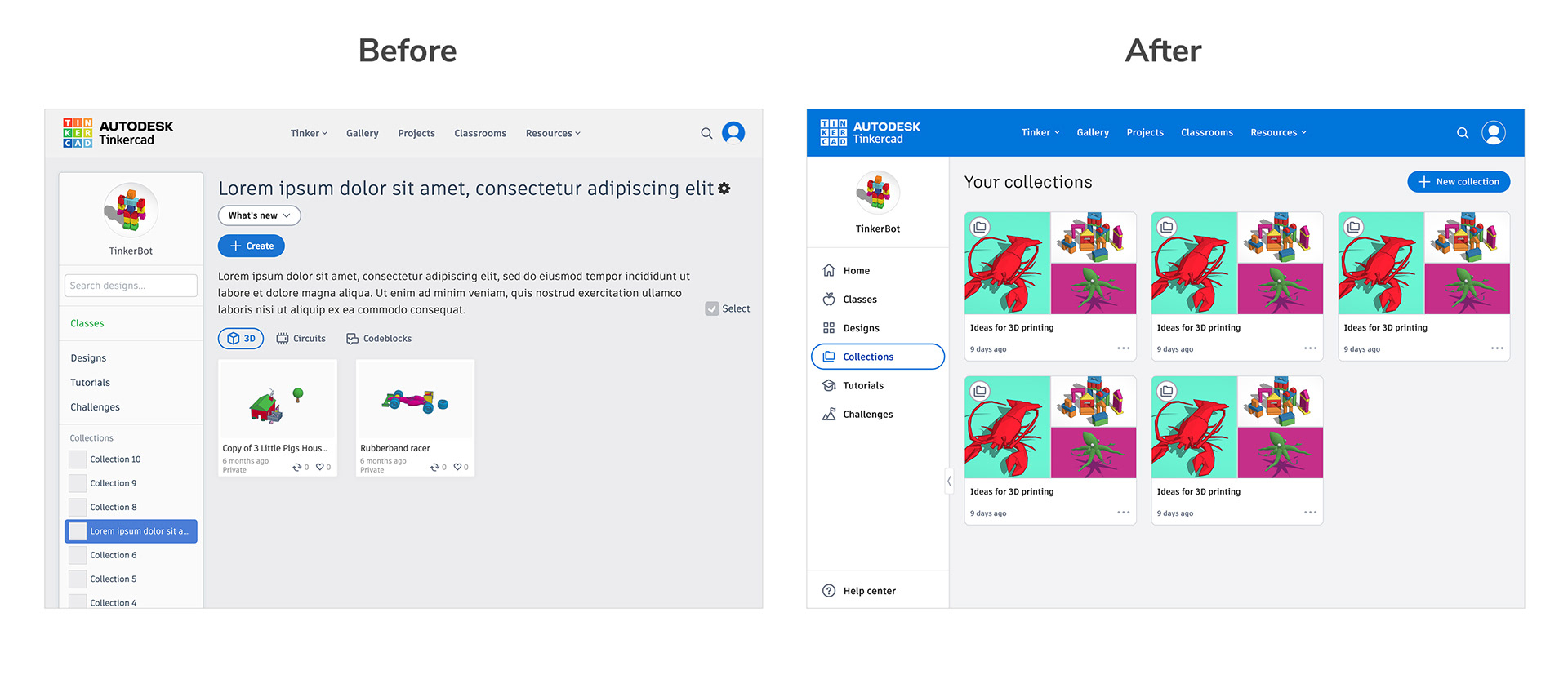
Summary of main improvements
Next we worked to identify a first round of improvements that would add a lot of immediate value and also set the groundwork for further enhancements later on.
• Attached left nav instead of floating box provides a more consistent experience.
• Attached left nav instead of floating box provides a more consistent experience.
• Ability to expand/collapse the left panel improves usability on smaller devices such as Chromebooks and tablets.
• New Homepage with space for marketing banners and timely announcements.
• Collections merged into a single page instead of stacked in the nav. Makes for better organization and introduces a new overview page to browse and manage collections.
• Broken search fixed and moved to page level so that it works as expected.


Mobile improvements
The old mobile dashboard was not very functional or mobile friendly. The page navigation took up the entire screen so you had to scroll to see actual content and some page content wasn't responsive at all. We decided to move the nav to a top sticky scrollbar to make it always accessible and save space.


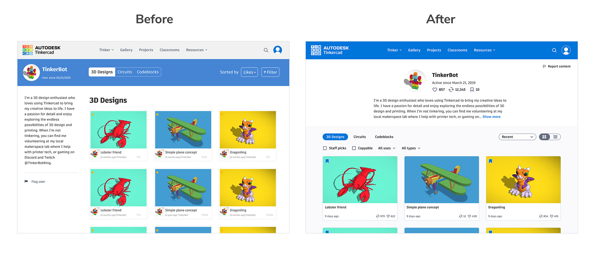
Revitalized user profile
The profile is where users go to manage their public view and keep up with the activity of their fellow Tinkerers. The old profile did not handle empty states well and also confusingly showed users designs that were not publicly viewable. This redesign elevates the user about info (with space to expand this area with stats over time) and introduces larger design cards to better celebrate and show off users' work.