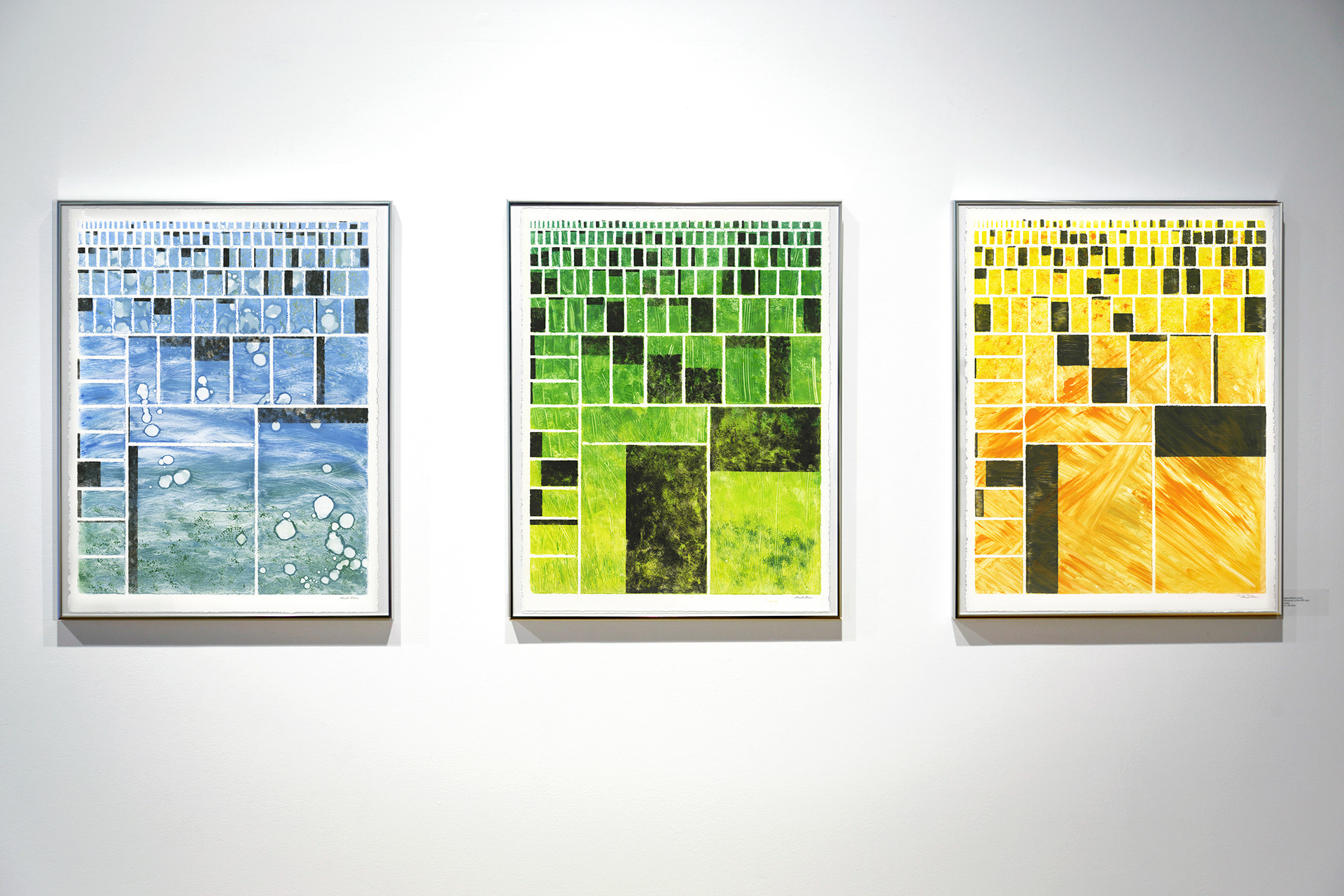
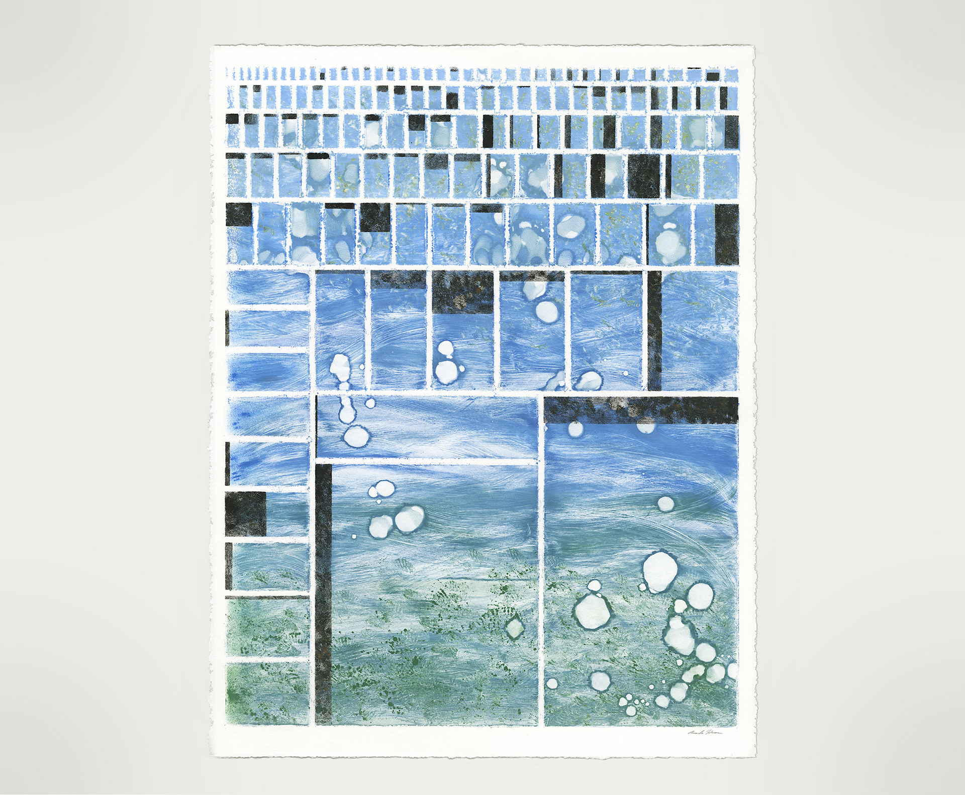
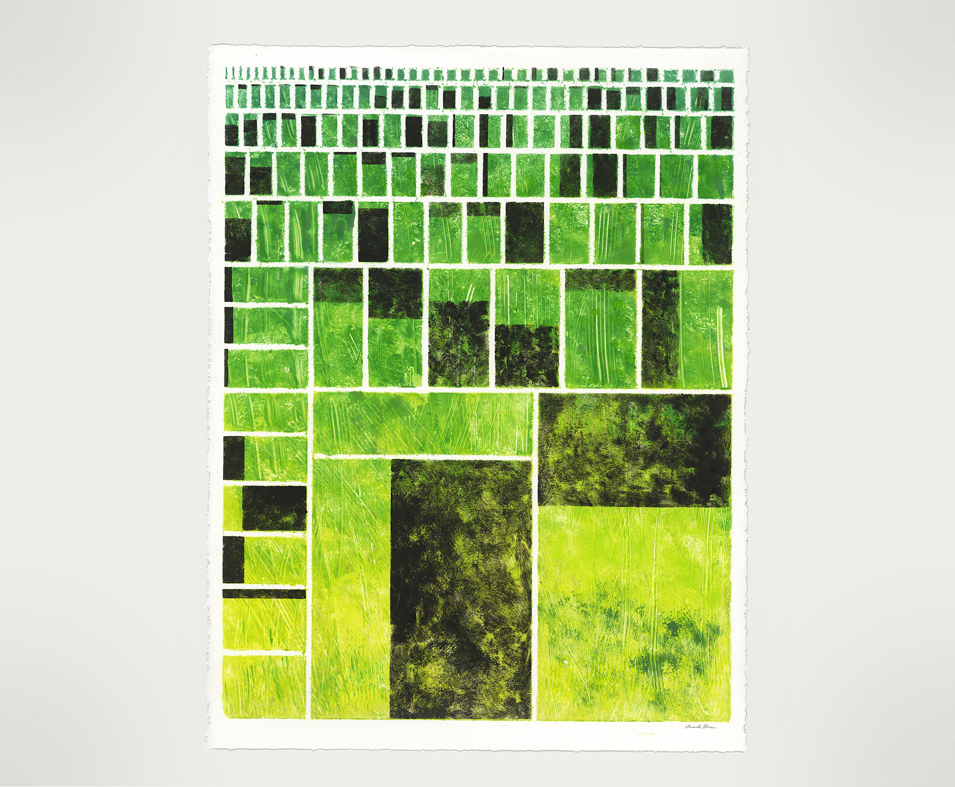
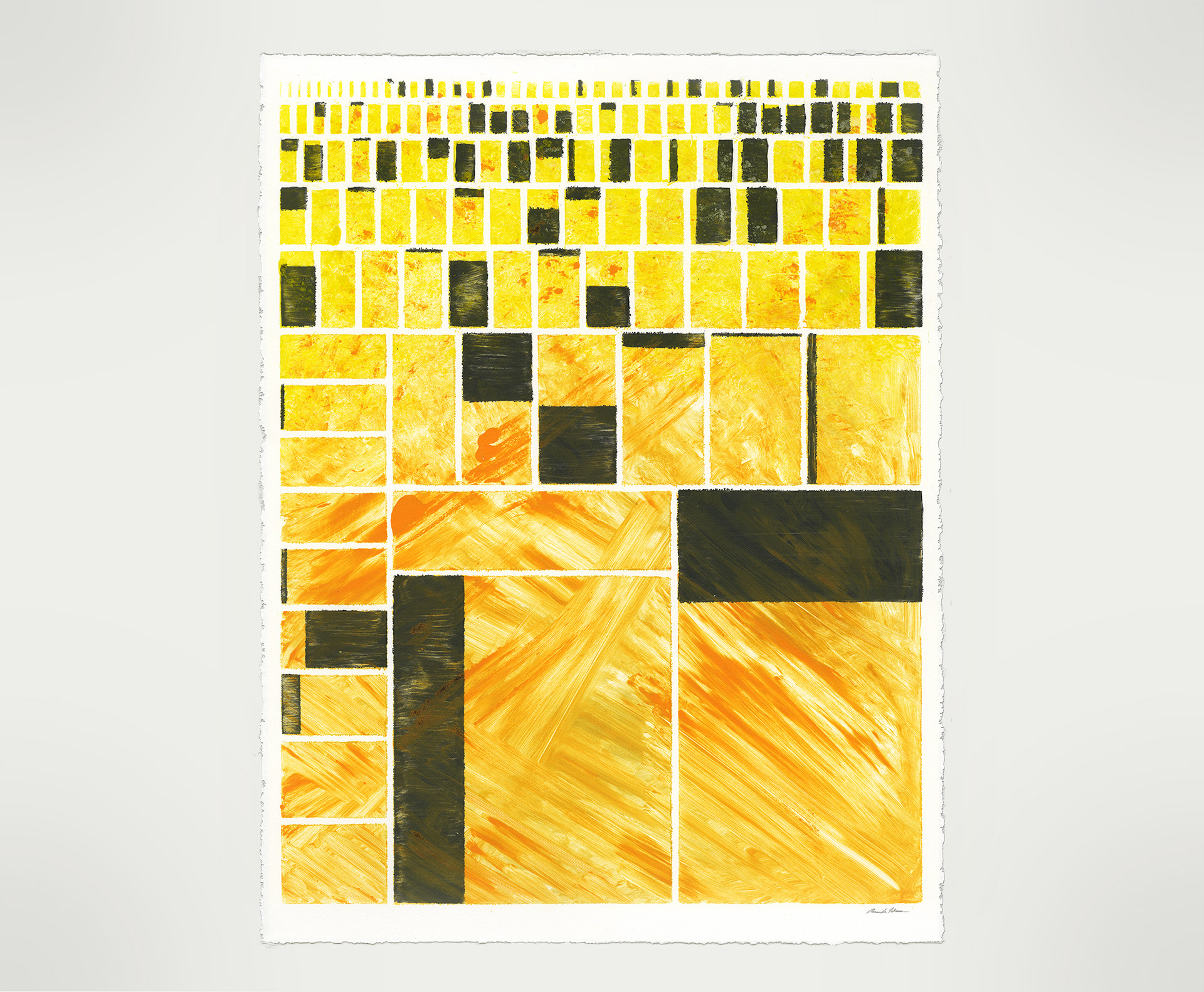
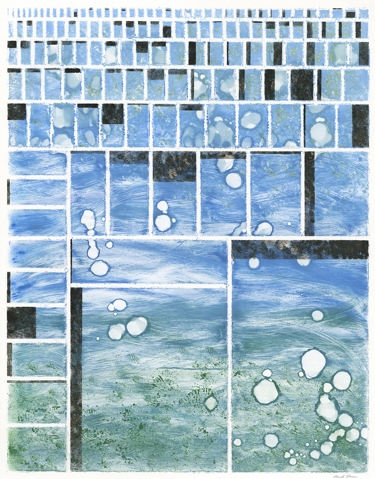
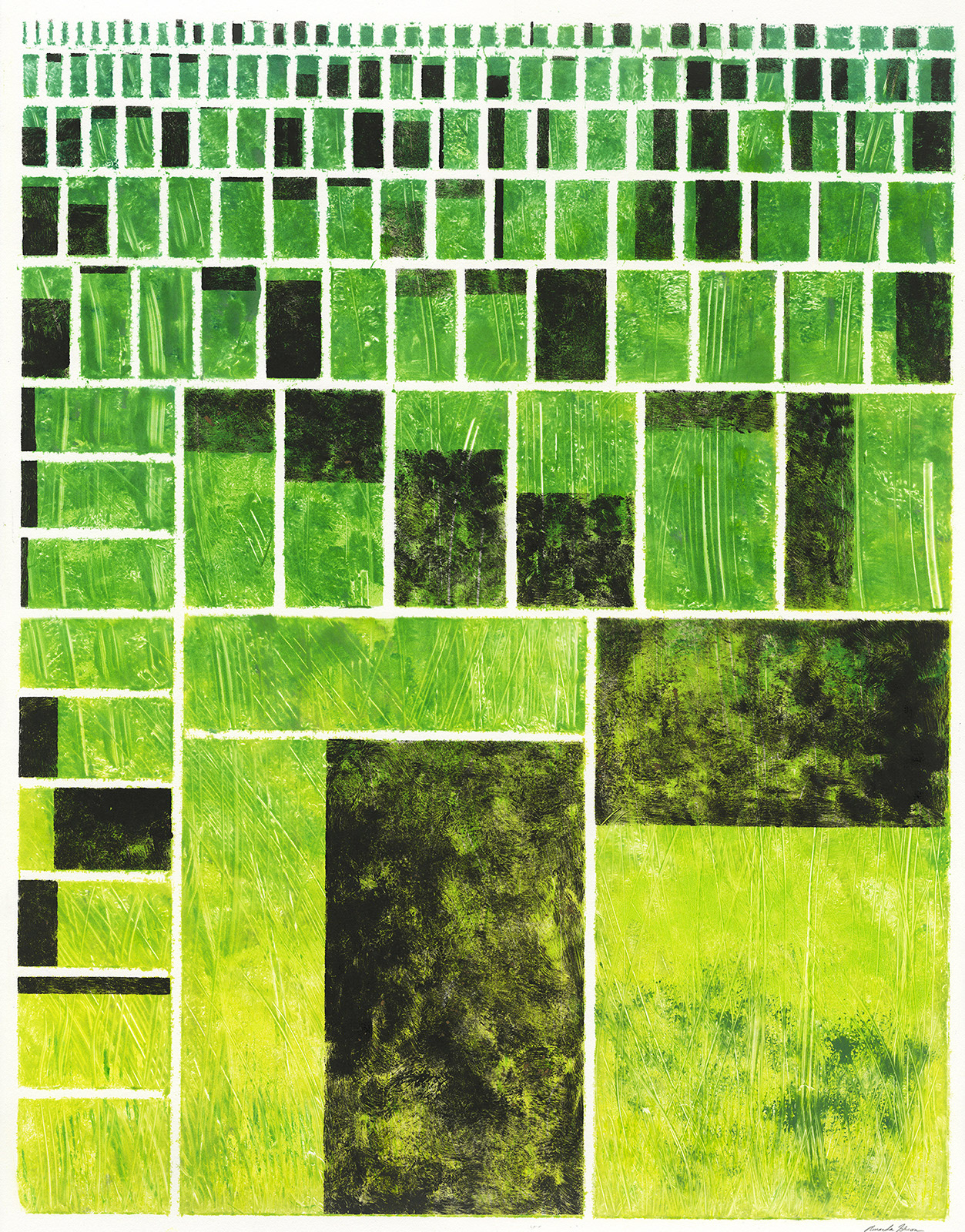
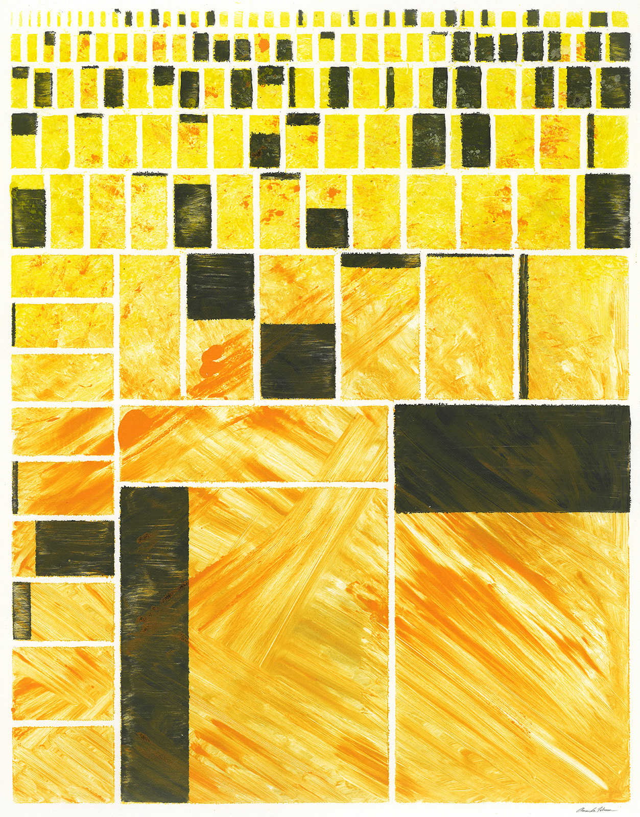
22 x 28 in monoprints on Rives BFK paper.
These images are tree map infographic charts made with data from the 2014 Human Development Report. The overall size of each of the squares represents the total population of a given country. For example, the largest squares on the bottom are China and India, with the largest populations. The brown shaded regions overlaid on top of each country's square represent the percentage of that population currently living without a basic necessity due to environmental deprivations.
These images are tree map infographic charts made with data from the 2014 Human Development Report. The overall size of each of the squares represents the total population of a given country. For example, the largest squares on the bottom are China and India, with the largest populations. The brown shaded regions overlaid on top of each country's square represent the percentage of that population currently living without a basic necessity due to environmental deprivations.
The blue composition maps the percentage of world population living without access to safe drinking water, the green composition maps the percentage of world population living without access to adequate sanitation, and the orange composition maps the percentage of world population living without access to electricity.